Redesigning Digital Space: The Sprinklr Community

The Architecture of Engagement

Role Project Lead
Timeline 6 months
Tools Figma

Project Overview: Framing the Redesign

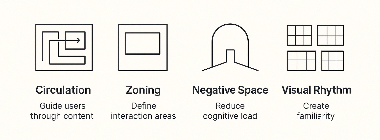
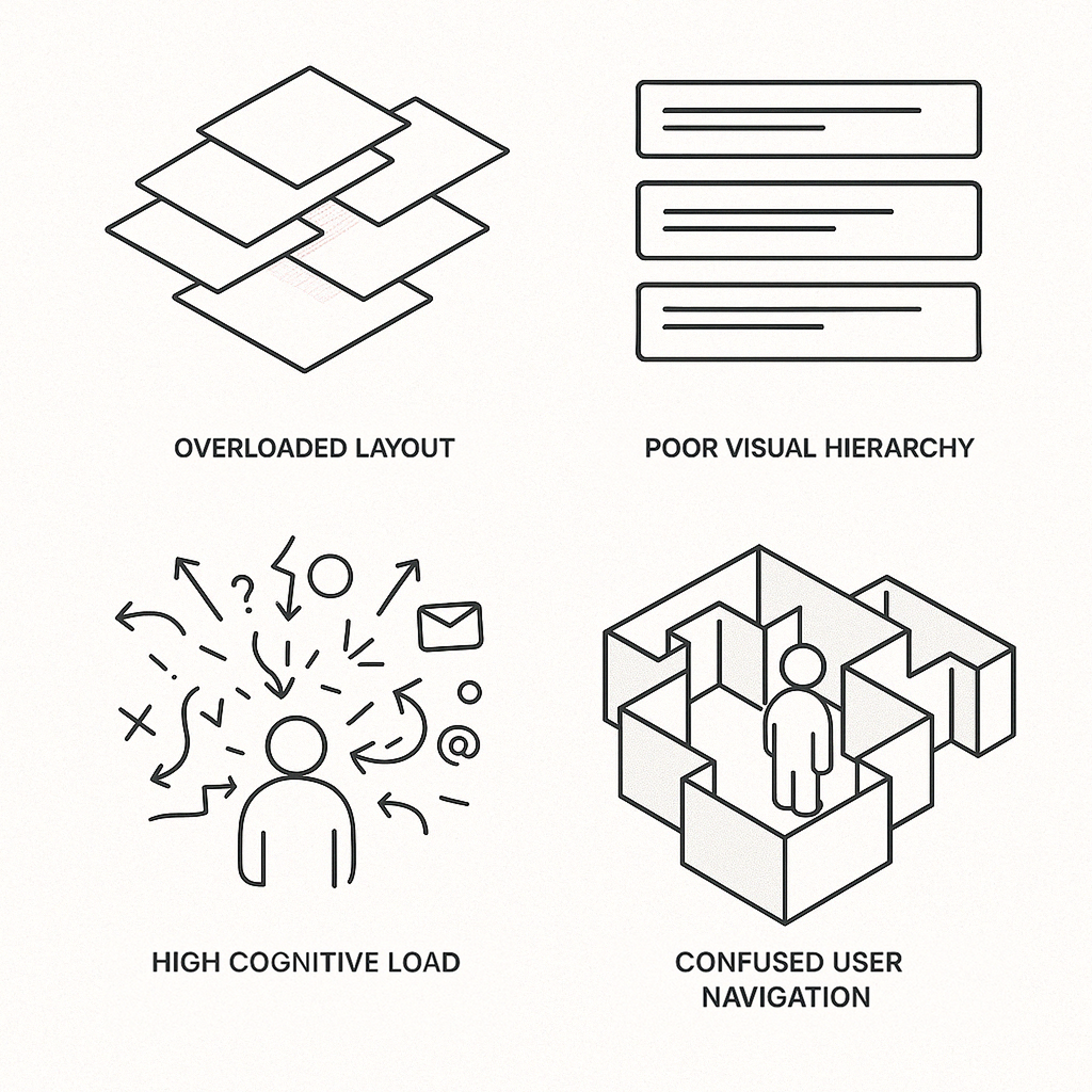
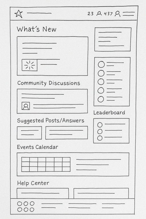
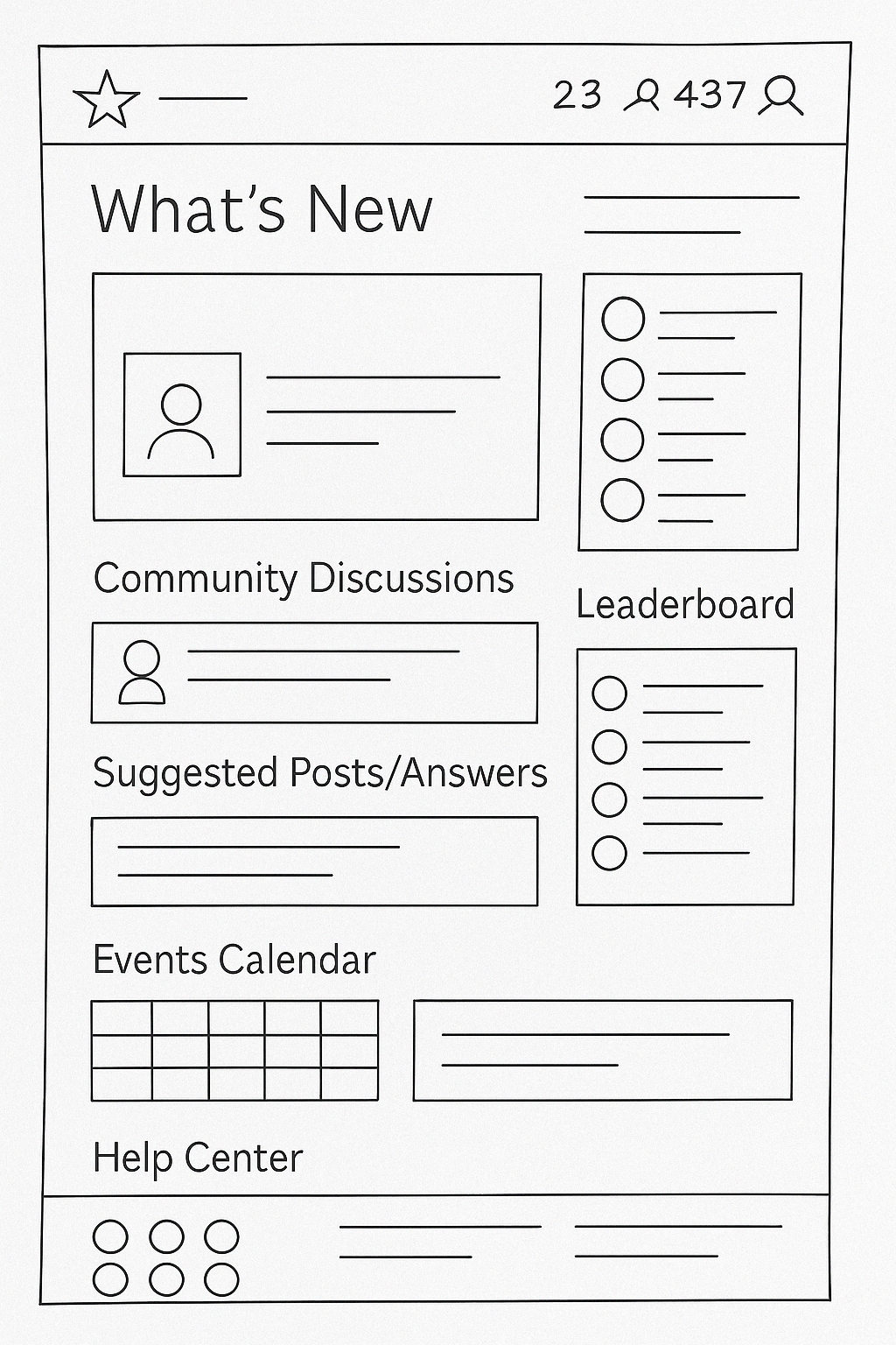
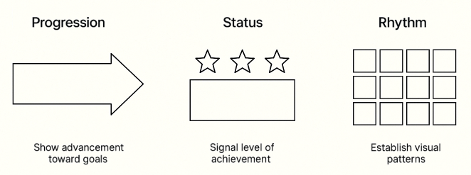
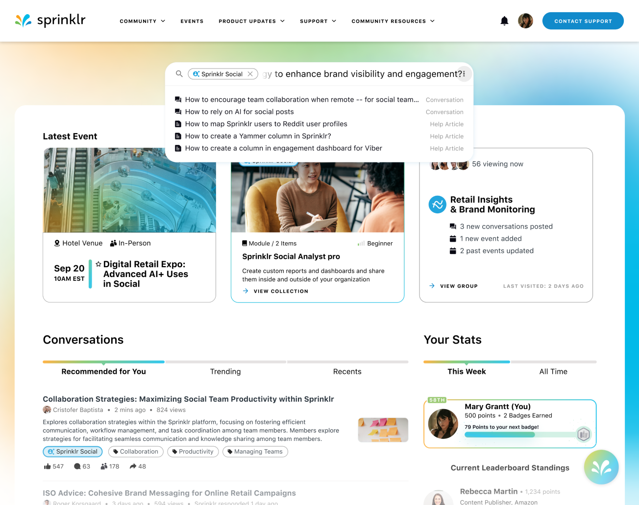
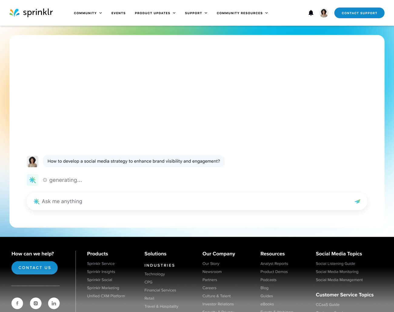
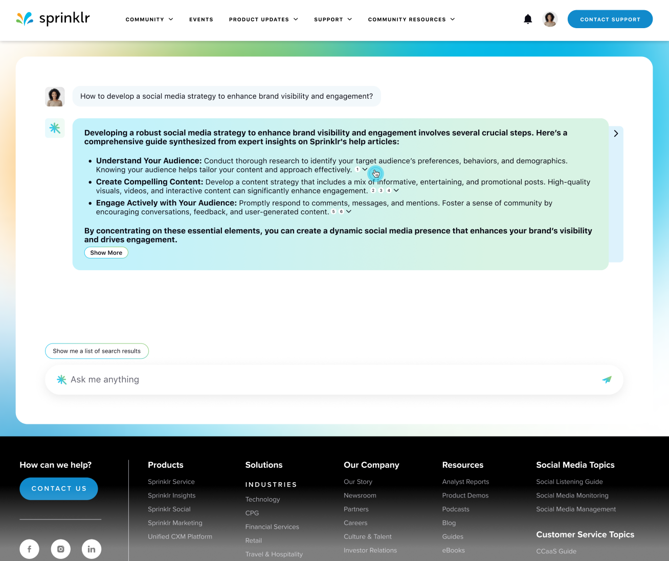
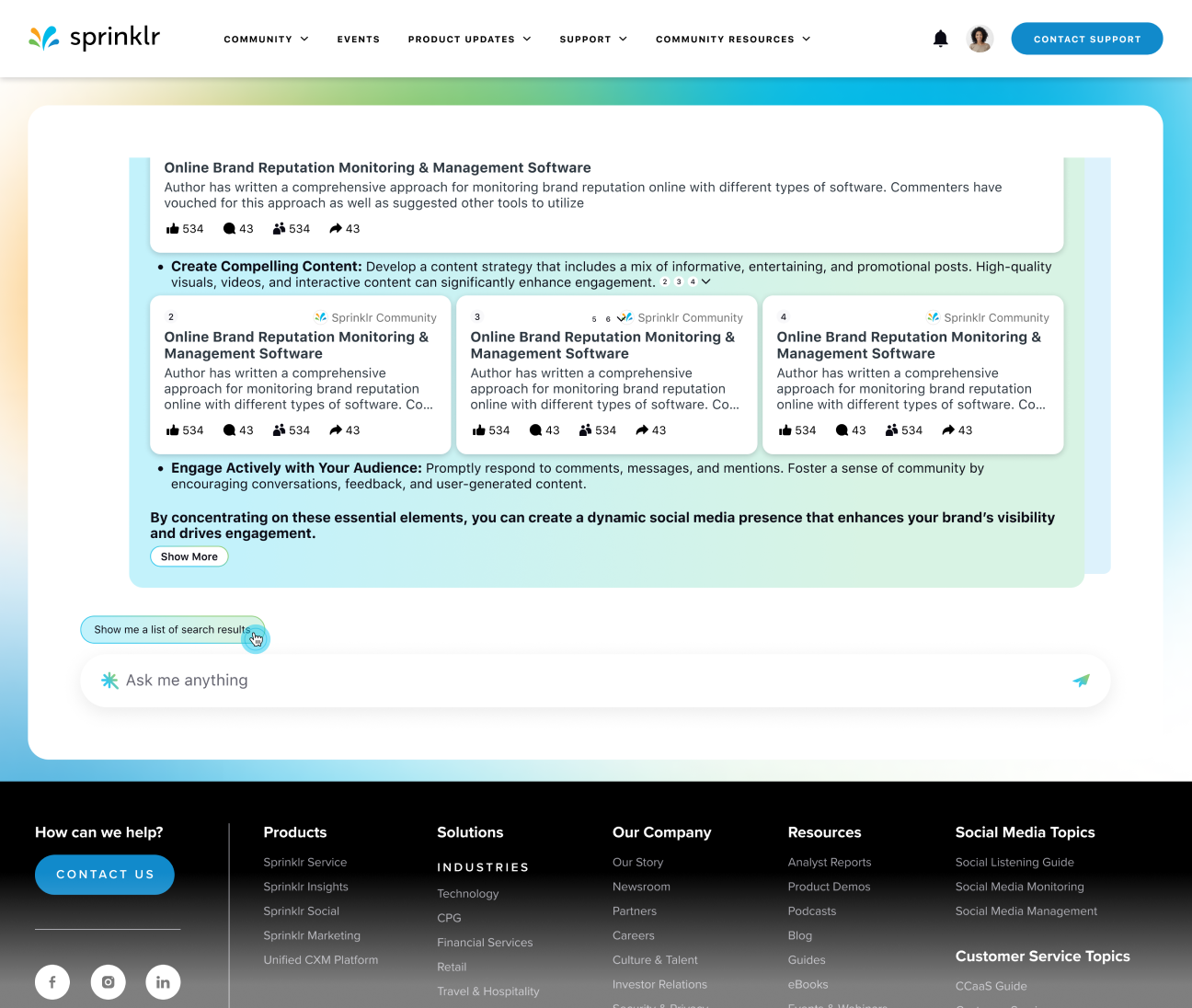
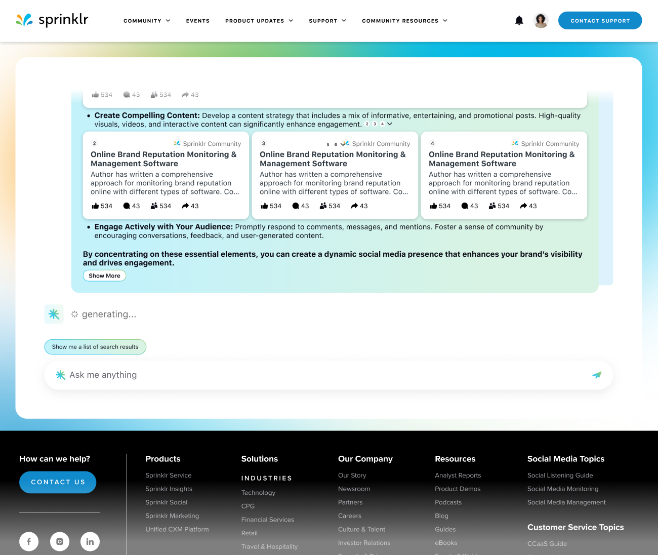
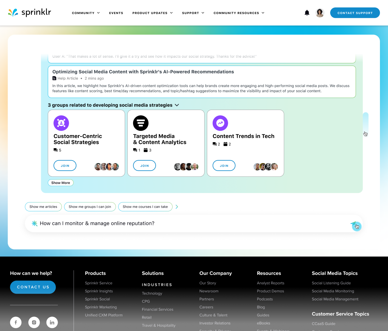
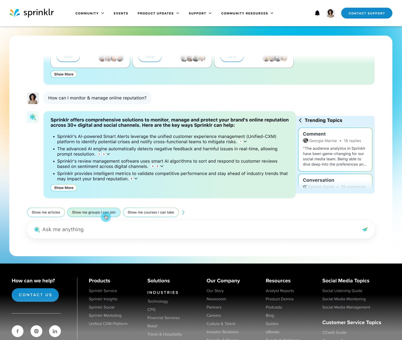
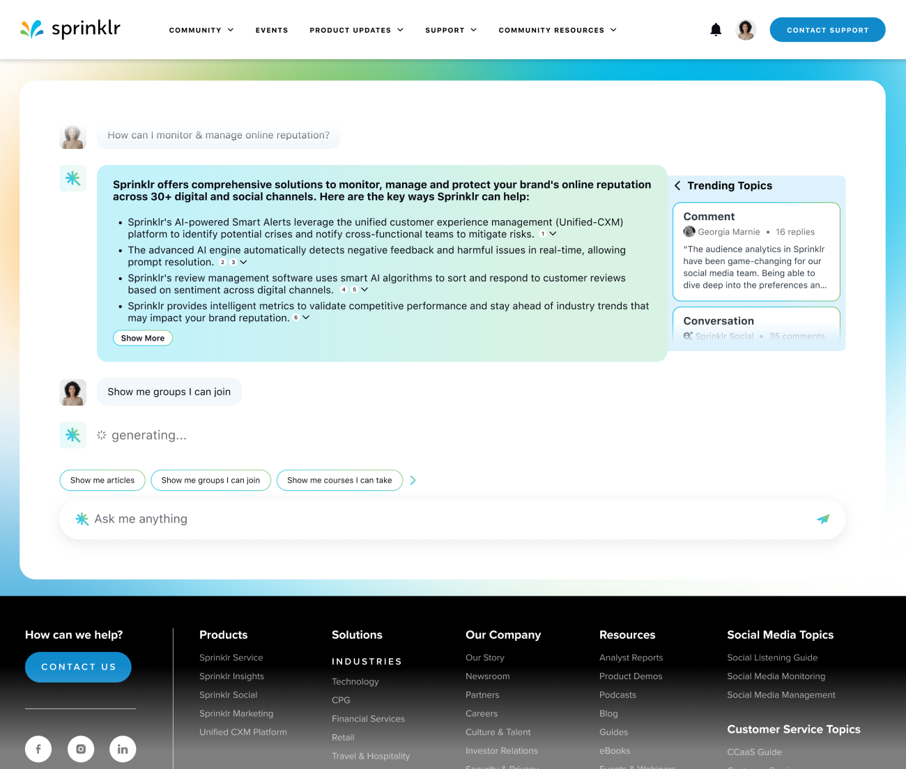
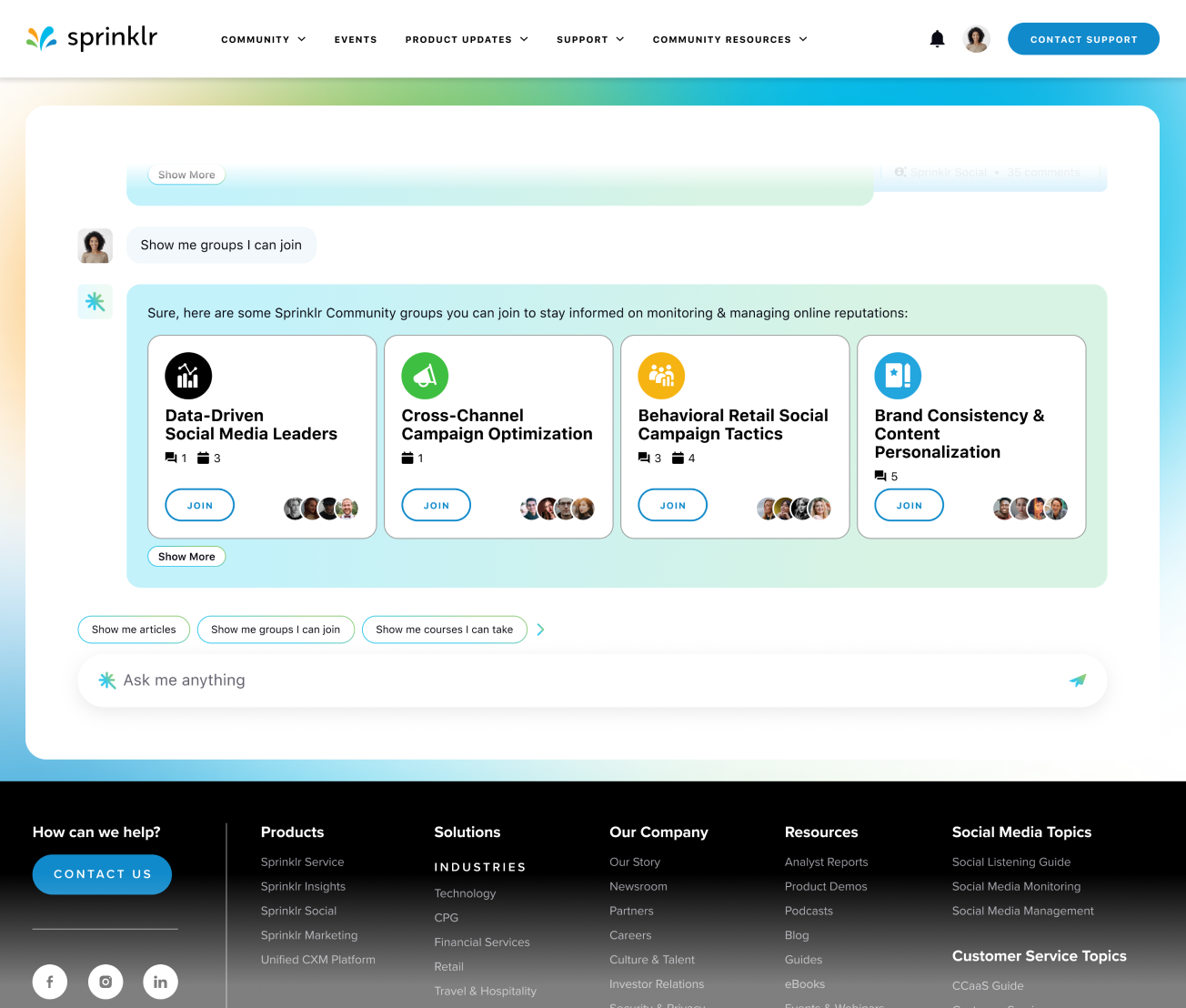
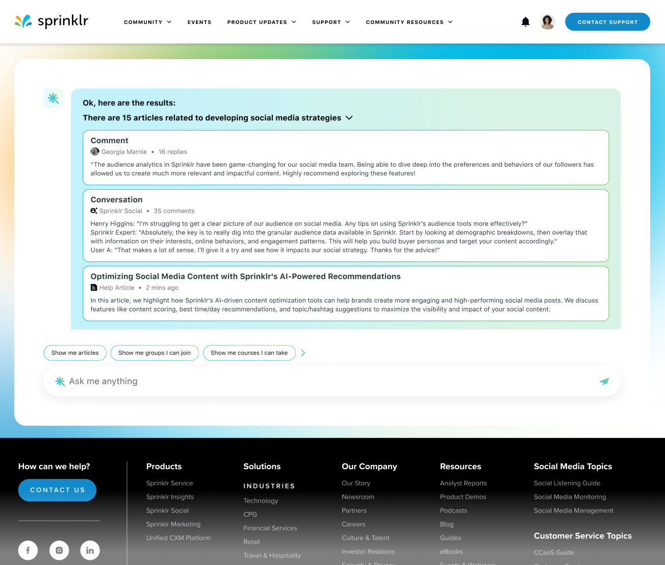
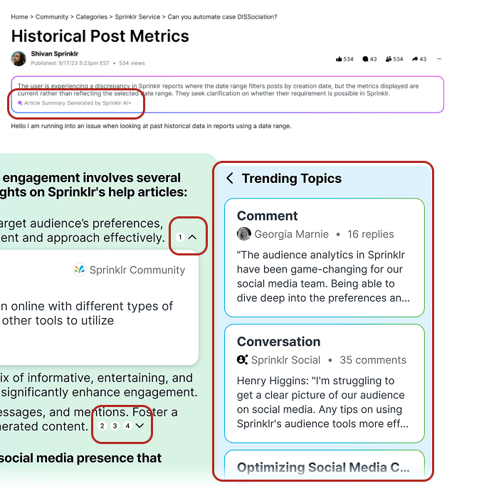
One of my key contributions at Sprinklr was leading the redesign of the Community platform, launched in May 2024. I approached the platform as a spatial experience, using my background in architecture to rethink the structure and flow of the interface. By treating digital elements like physical forms, I applied principles of circulation to guide users seamlessly through content, and used zoning strategies to clearly define interaction areas. Negative space became a critical tool to reduce cognitive load, allowing users to focus and breathe within the layout. I also introduced visual rhythm through consistent patterns and modular components, creating familiarity and coherence across the experience. This architectural approach helped us transform a cluttered, dated platform into a clean, intuitive, and engaging community environment. Let me walk you through how we reshaped this digital space.

Figma File

Leading the Build: From Vision to Execution

person Project Lead Designer

Led end to end the design for Community Homepage, User Profile, Conversations, and AI-powered Search.

group Collaborator

Collaborated closely with PMs, engineers, researchers, over six months.

lightbulb AI-First Thinker

Integrate AI-powered insights to boost user engagement.

palette Visual Design

Applied consistent visual design principles to create a cohesive interface.

From Constraints to Opportunities: Rethinking the Community Space

The original dashboard was crowded and hard to navigate, which made it frustrating for users to manage multiple social media accounts. As the lead designer, I treated the interface like a physical space. I created clear zones for different tasks, opened up negative space to make the layout feel lighter, and designed visual pathways to guide users smoothly through their work. This helped turn a confusing experience into one that feels organized, intuitive, and efficient.

Low Engagement
  • Low participation rate
  • Low user retention
Cluttered UI
  • High cognitive load
  • Hard to navigate
  • No hierarchy
Dated Experience
  • Lack of modern UX patterns
  • Lack of consistency

Before the Renovation: Assessing the Existing Structure

The previous design of the Sprinklr Community lacked visual hierarchy and spatial clarity, which led to confusion and frustration for users. As I examined the layout, it felt like a dense structure with no clear flow. The absence of defined zones and negative space created a high cognitive load, making it difficult for users to navigate, read, and understand the content. I saw an opportunity to redesign the experience using architectural principles to bring order, balance, and ease into the interface.

Site Analysis: Research as the Foundation

I brought researchers into the process early and initiated daily standups with them and the PMs to deeply understand use cases across different brands and personas. Like studying how people move through a physical space, I focused on observing real user behaviors to identify friction points and unmet needs. This foundation helped me design with intention, ensuring every element served a clear purpose within the overall structure.

Figma File

Designing from the Ground Up: Understanding User Needs

Users shared that they wanted a cleaner and more organized experience, with quicker access to important features. Many also asked for more options to personalize the dashboard to fit their needs. I treated this feedback like designing a flexible living space, making sure the layout was both easy to use and adaptable for different types of users.

1. Customization

Enterprise brands wanted customization without disrupting UX consistency.

2. Navigation

Users struggled to navigate cluttered layouts and find relevant discussions.

3. Gamification

Gamification elements were missing, leading to low user participation.

4. AI-Search

Integration of AI-powered features to boost user engagement.

How Might We Reconstruct Sprinklr Community into a More Engaging, Relevant, and Modern Space?

I used a modular design approach, similar to assembling adaptable building blocks, to let users customize their dashboards with widgets that show the information they care about most. I also enhanced the visual design with a more modern and cohesive look to make the platform feel more inviting, engaging, and easier to use.

Modular UI
  • Applied Hyperspace Design System
  • Modular UI framework.
  • Consistent navigation patterns.
  • Content hierarchy improvements.
Gamification
  • Introduced a badge system for active contributors.
  • Added leaderboards showcasing top community members.
  • Rewarded users for their contributions.
AI-Search
  • Introduced AI search result explanations
  • Enhanced search ranking based on relevance, behavior, and engagement metrics

Hyperspace Design System: A Modular Framework for Engagement

I applied the Hyperspace Atomic Design System (Sprinklr Design System) to bring structure and clarity to the Community platform. Inspired by architectural systems, I approached the interface like a modular framework with repeatable design elements that scale seamlessly across brands. I used zoning to organize reusable patterns, applied visual rhythm for consistent interactions, and introduced hierarchy to make content more scannable and easier to find. The result is a modern, cohesive experience that feels intuitive and engaging.

  • Ensuring a cohesive & scalable UX across all brands.
  • Reusable patterns that make interactions more intuitive.
  • Making information scannable & easy to find.

Foundation of Consistency: UI Components as Building Blocks

I created a library of standardized UI components to bring structure and consistency across the platform, much like using a unified set of materials in architectural design. Each component served as a modular building block, designed to fit seamlessly within the larger system. I used wireframing to map out their spatial relationships and functional roles, helping to visualize how users would move through the interface with clarity and ease.

component list

Component List

Components are grouped into categories based on their functionality.

component

Make it modular

component list

Wireframe Example

wireframe example

Wireframe Example

Modular Foundations: Designing for Flexibility

I applied a modular UI approach similar to designing flexible interior spaces. Users can personalize their dashboards by rearranging dynamic components, just as movable partitions adapt a room to different needs. This flexibility gives each user control over their environment while maintaining a cohesive structure throughout the system.

Designing for Engagement: Gamification as Spatial Incentive

I treated user engagement like designing for movement and interaction within a space. By implementing gamification strategies, I introduced visual markers such as badges and leaderboards that acted like wayfinding elements, encouraging users to explore, contribute, and return. These reward systems created a sense of progression and recognition, making the community feel active and rewarding to participate in.

  • Badge System for active contributors.
  • Leaderboard showcasing top community members.

Shaping the Final Form: Review, Feedback, and QA

The design process followed a methodical build-up, involving multiple iterations that acted like phased construction. At each stage, I conducted hands-off reviews similar to structural inspections, followed by quality assurance checks to ensure the integrity and usability of the final experience. This approach helped shape a product that aligned with user needs and upheld a high standard of design clarity.

Figma File

Completed Structure: A Redesigned Community Experience

The final design of the new Sprinklr Community was shaped like planning a well-organized space. I focused on making it easy for users to move through the platform by creating clear paths and grouping related content together. The layout uses balance and consistent patterns to help users feel comfortable and stay engaged throughout their experience.

Measured Impact: Growth Through Design

The redesign acted like restructuring a high-traffic space with better flow and clearer access points. By organizing the layout with purposeful zoning and improving wayfinding through intuitive design, the platform became easier to navigate. As a result, brand adoption and user engagement increased significantly, while support tickets decreased due to enhanced usability and reduced friction.

25% Brand Adoption Increase
20% User Engagement Increase
15% Support Tickets Reduction

Design Decisions and Trade-Offs

Similar to renovating a complex structure, improving the user experience involved carefully considered trade-offs. The new design introduced a clearer layout and greater flexibility, but it also required more development time and thoughtful resource planning. Expanding customization was like adding new sections to a building. It provided more freedom but increased complexity in the backend. Gamification functioned as an interactive layer that boosted engagement, although some users felt the competitive elements were not essential to their experience. Each design choice was approached with balance, weighing both user value and implementation effort.

  • More customization meant more complexity in the backend.
  • Gamification increased engagement, but some users felt competitive elements were unnecessary.

AI-Powered Search: Smarter Search, Deeper Engagement

Adding AI-powered search was like putting clear signs and paths into a large building. It helped users move through the platform more easily and find what they needed without getting lost. This made the experience faster, more helpful, and more engaging for everyone.

Filling the Trust Gap: Designing Confidence in AI Discovery

Designing Clarity: AI Explainability and Blended Results

Making AI easier to understand was like showing the structure behind a building so people could see how things work. This helped users trust the results. Blended results, which combined AI suggestions with user-generated content, worked like mixing different materials to build something stronger and more useful.

traditional search

Traditional Search

Returns keyword-based results in a fixed order, offering limited personalization and requiring users to manually find what they need.

AI-Powered Search

AI-Powered Search

Delivers context-aware, blended results that adapt to user behavior and intent, making content discovery faster, more relevant, and more engaging.

AI-Enhanced Search Experience: Dual Pathway Interaction Flow

This diagram illustrates the user journey in Sprinklr's AI-powered search experience. After entering a search query from the homepage, users encounter a split pathway:

  • On the left path, users receive an AI-generated response, which they can interact with by asking follow-up questions. This iterative loop enables deeper engagement and continuously refined answers.
  • On the right path, users can view all search results, including a mix of AI-generated, user-generated, and traditional content. They can select any result to explore more information directly.

Final Design: AI-Powered Search Flow span

Figma File


Impact: Increased AI Adoption, Engagement & Reduced User Complaints

The implementation of AI features led to increased user adoption and engagement, while also reducing complaints related to search functionality.

35% AI Adoption Increase
20% User Engagement Increase
20% User Complaints Reduction

Design Decisions and Trade-Offs

Balancing the benefits of AI with user privacy and data security was an important part of the project. I treated transparency like adding windows to a space, helping users see how things work while still feeling safe. This required adding simple explanations in the interface to build trust.

For discovery, I designed the experience like planning smooth walkways through a large building. I encouraged users to explore new content, but organized it carefully so the experience felt clear, not overwhelming.

Transparency

Making AI transparent reduced friction, but required more educational UI elements.

Discovery

Encouraging user discovery means more content will be introduced and required balancing to avoid overwhelming users.

Trust Issues

What I Learned: Reflections from Rebuilding the Experience

This project taught me to approach design like shaping a space around the people who use it. I learned the importance of user-centered thinking, treating feedback as part of an ongoing construction process through iterative testing. I also saw how essential clear communication is, much like the coordination required between architects, builders, and planners to bring a vision to life.

Final Product: Homepage

The final homepage design reflects the new branding and user experience principles established throughout the project.

Figma File

Final Product: User Profile

The user profile design emphasizes personalization and ease of access to user settings and preferences.

Figma File

Final Product: Conversation

The conversation interface is designed for clarity and engagement, allowing users to interact seamlessly.

Figma File

Final Product: AI Search & AI Summarization

The AI search feature enhances content discovery, while summarization tools provide quick insights into discussions.

Figma File

Promotional Video

If you have made it this far, I hope you enjoy the video!

Recommended Projects

Explore these projects for more insights and inspiration.

Project 2
5 min read

Sprinklr AI+

Sprinklr's AI+ Design System.

Web Design E-commerce
View Case Study
Project 3
6 min read

Endue Software

Healthcare deserves a better UX.

Dashboard Design Data Visualization
View Case Study