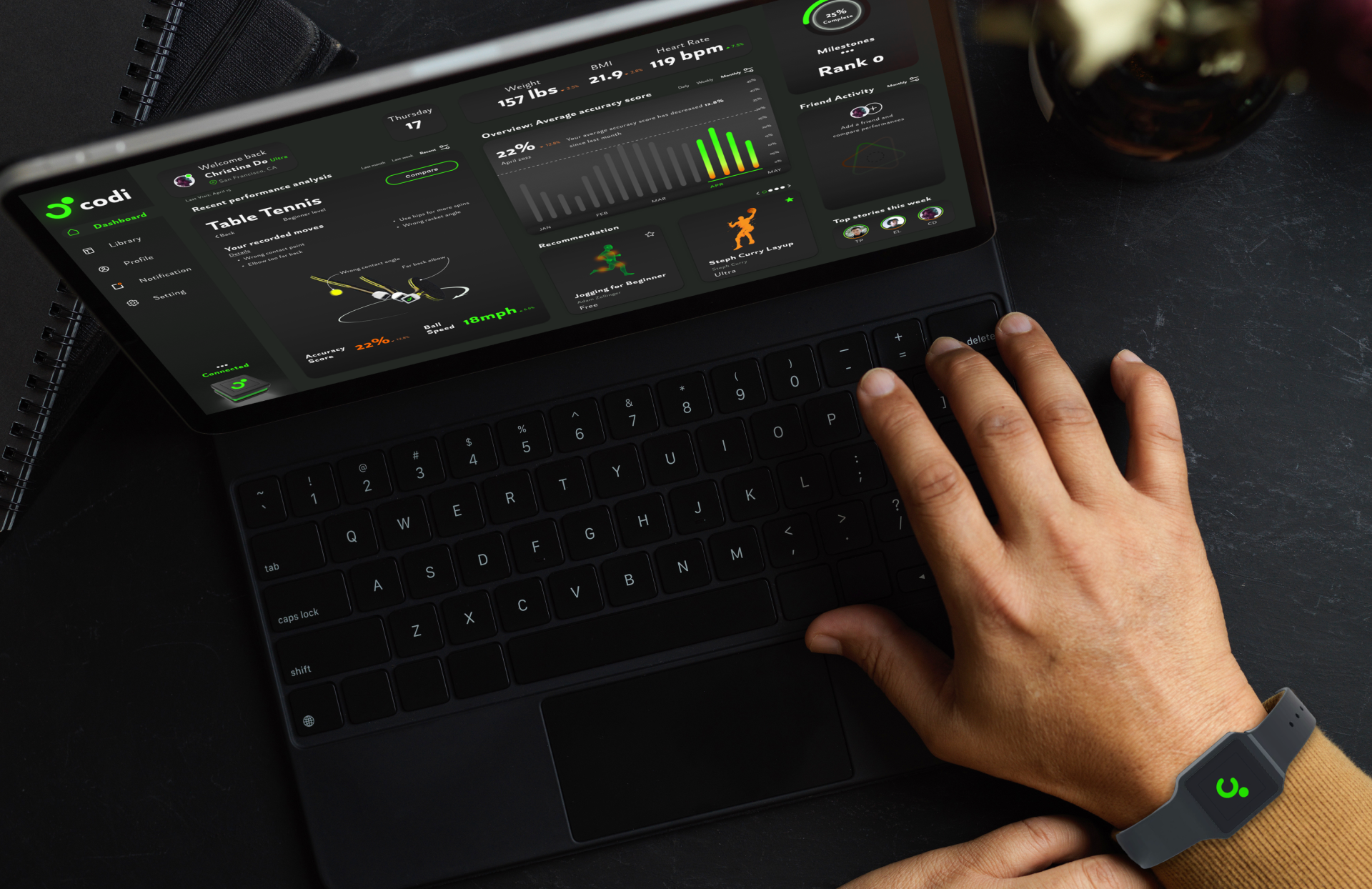
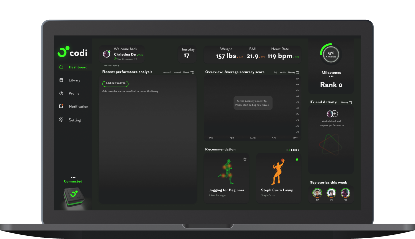
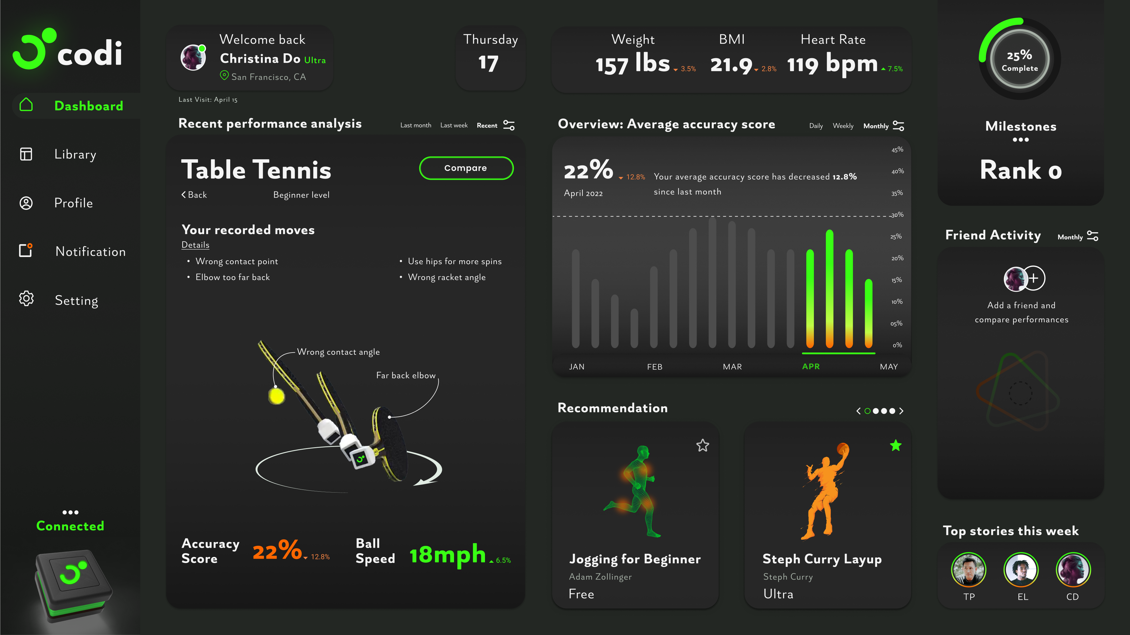
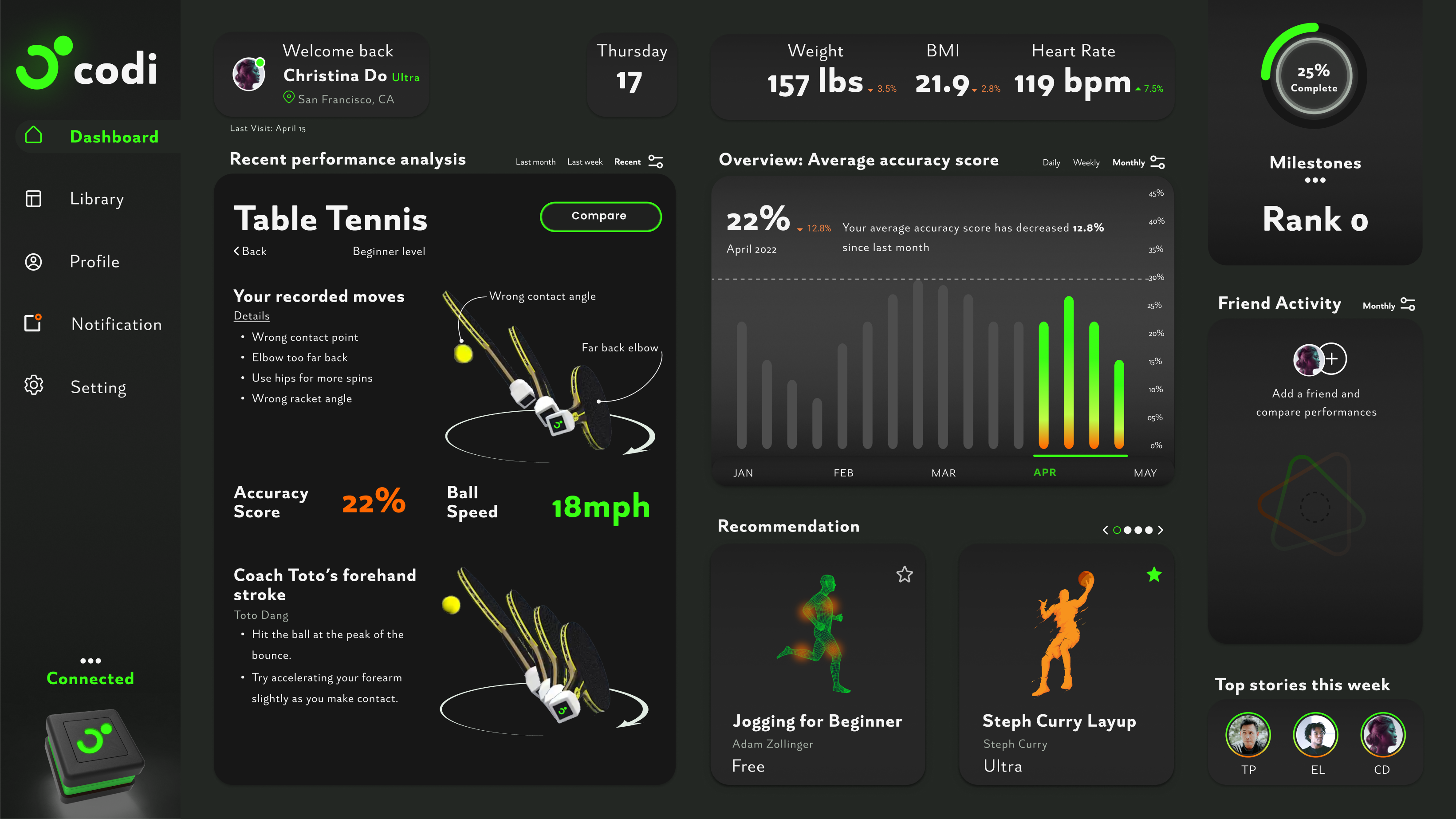
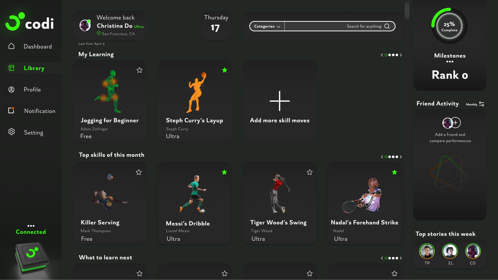
Design Strategies
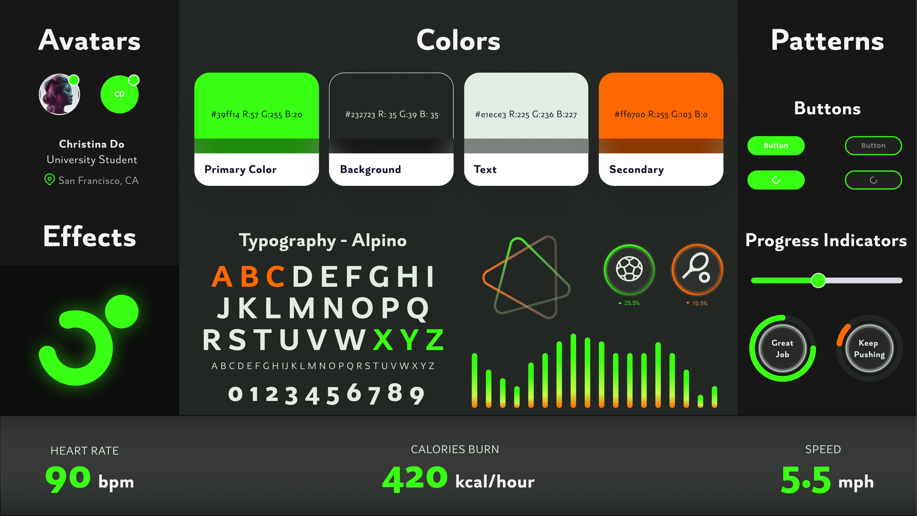
Codi is about precision, energy, motion and positivity. In order to express the feeling of
Codi, I have discussed with the project manager, developers and CEO about the color themes
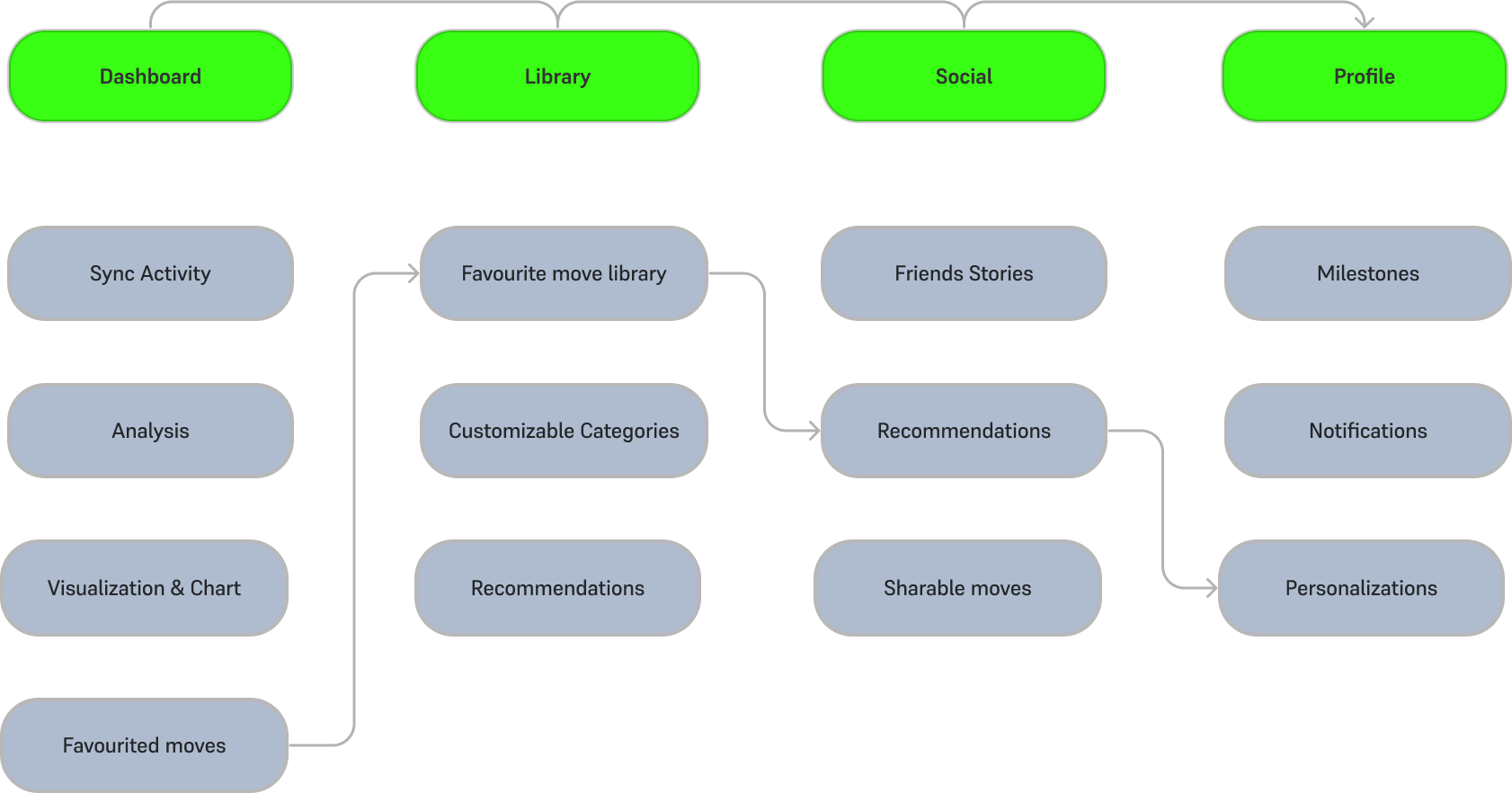
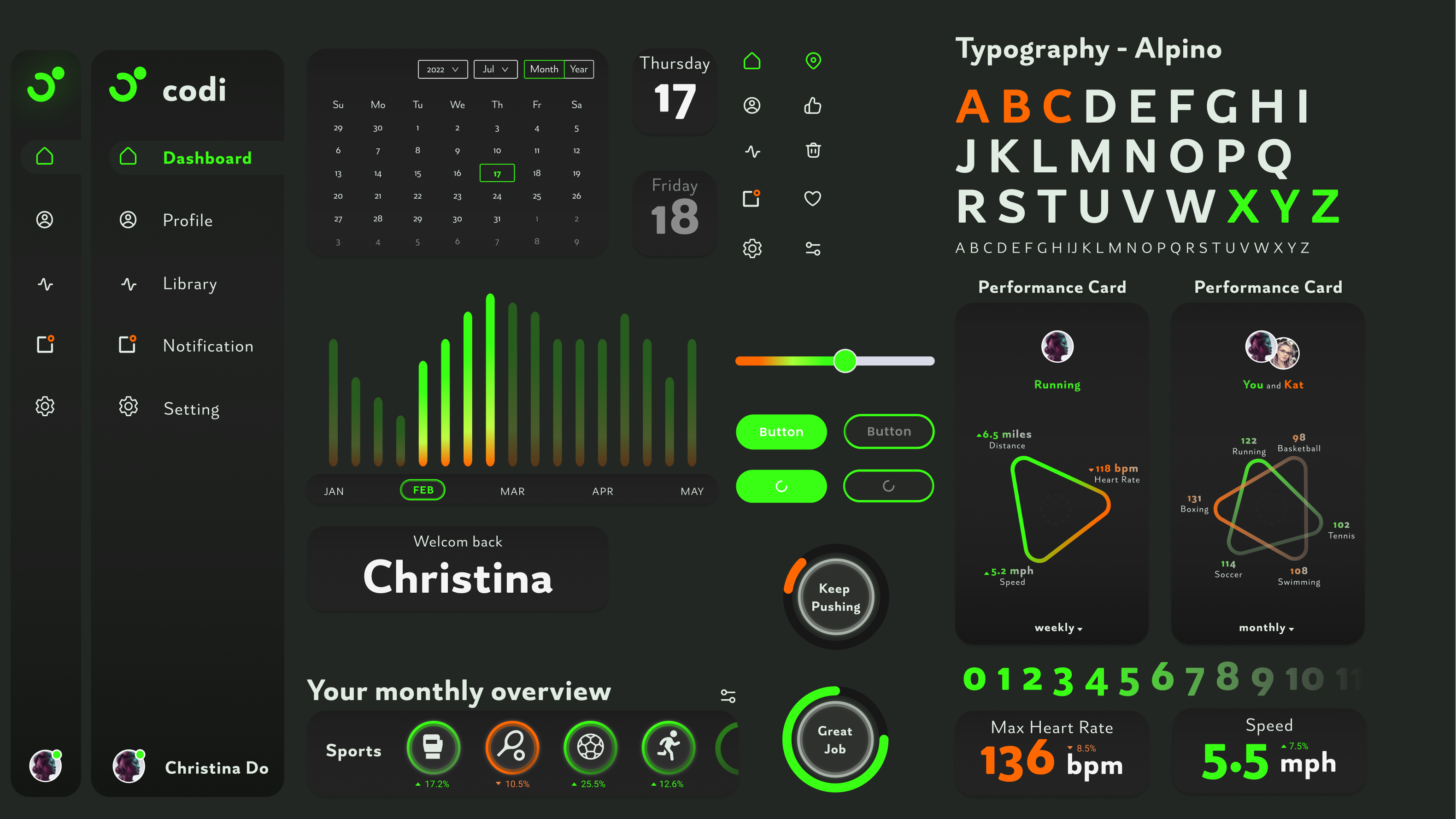
by providing visual inspirations. Body motions, UI elements and typography are the primary
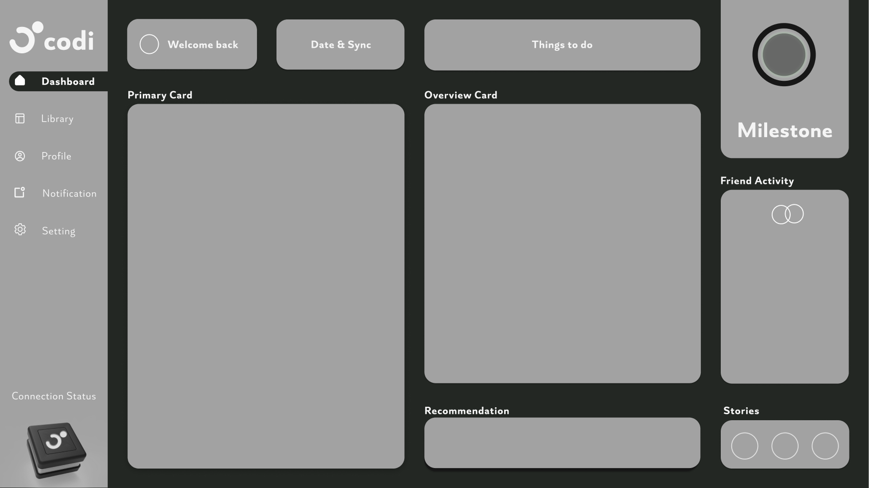
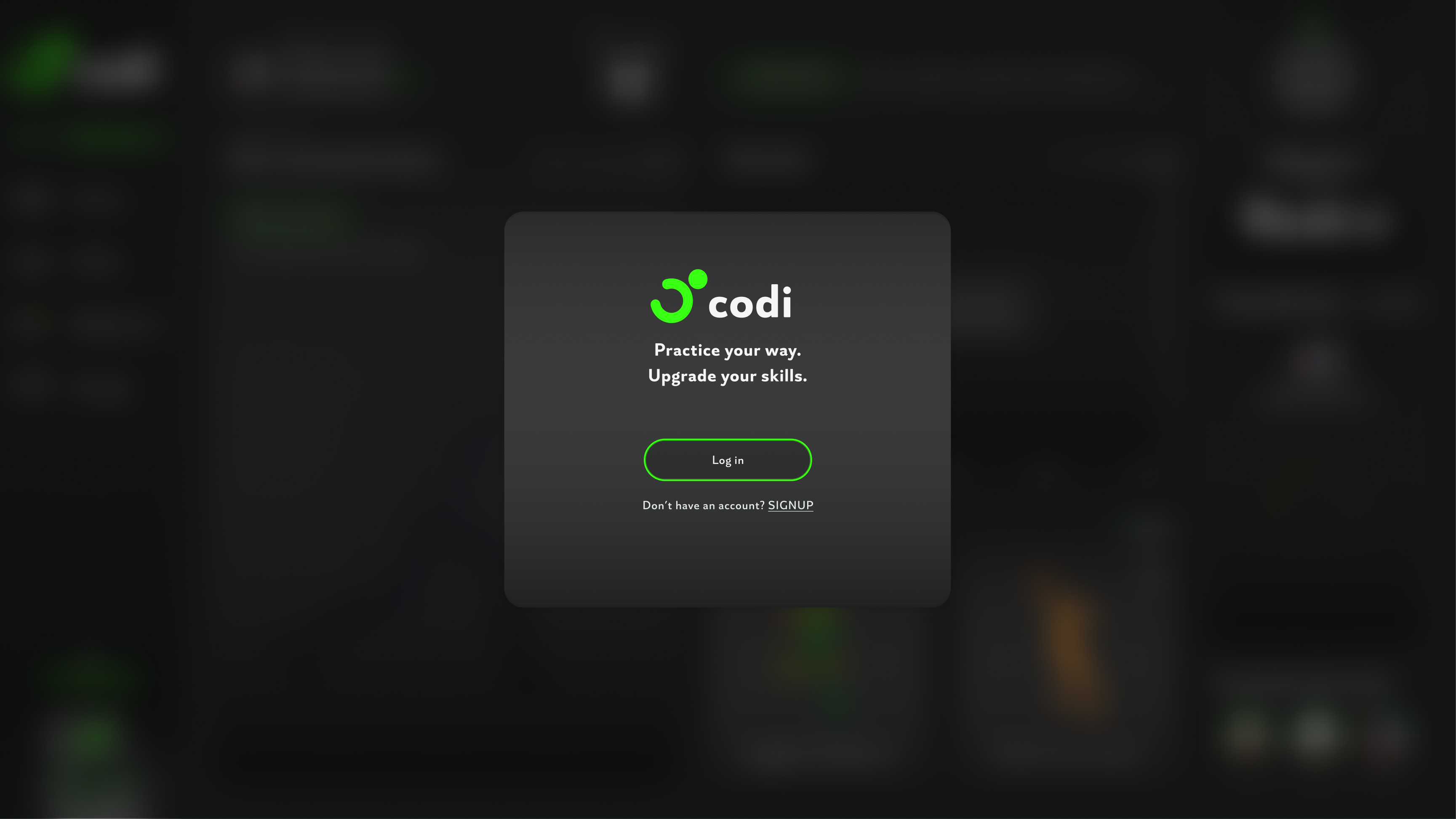
focus of the dashboard. Therefore, we come up the idea of dark theme paired with neon
contrast colors where it could speak a more powerful language to the users. We have switched
the original neon orange of Codi to a neon green because we believe it is a more energetic
approach.
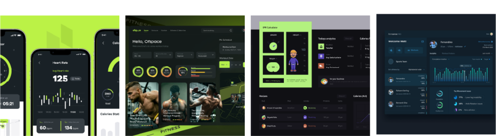
I used the Visual Inspirations, Moodboard and Style Tiles library as a starting point and
developed a more detailed Design Language document such as Logo Redevelopment, UI elements.
It’s purpose is to ensure consistency and communicate the language of Codi to our
stakeholders.